Social Cards
It is a refined, minimal UI component built for Next.js and Framer Motion.
Live Preview
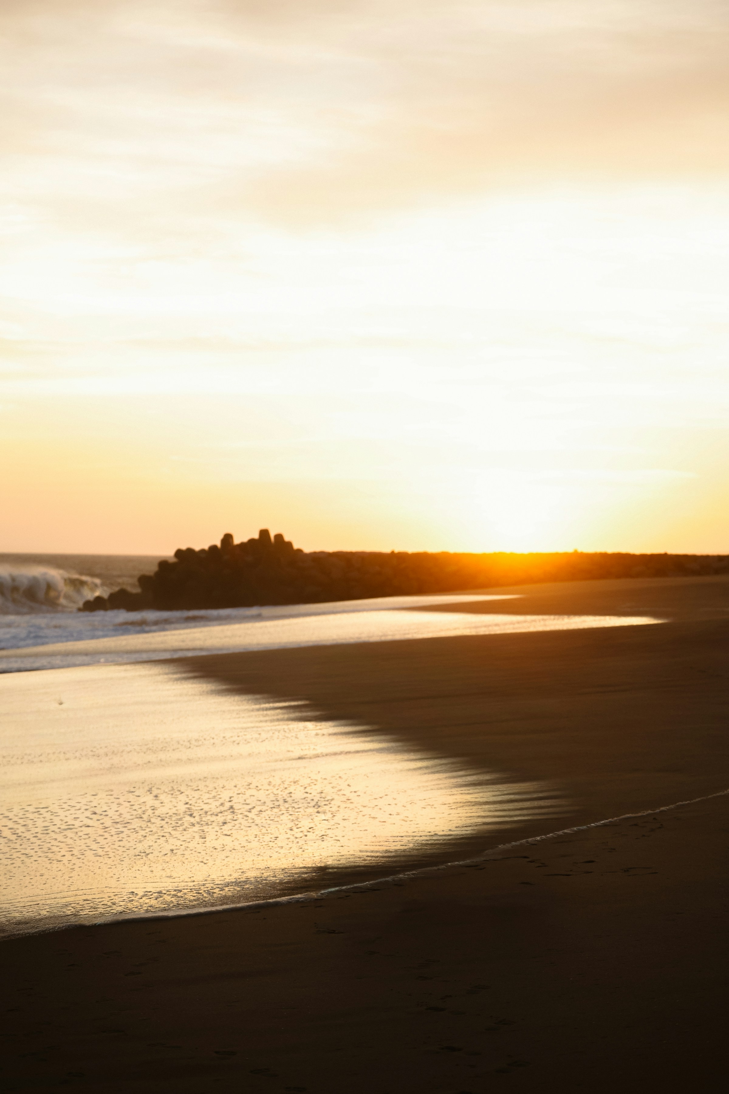
Beaches
Let the sea set you free

Greyscale
The art of black and white, expressing the colors of the soul.

Japan
The Land of the Rising Sun

Mritunjay Rai
A web developer learning from world !

Chinese Temple
A mirror in the temple reflects the Buddha within.

Winter
Snowflakes are winter's butterflies.

Bixby Bridge
Standing 260 feet above the crashing Pacific.
Dependencies
npm install
framer-motionCode
import { useState } from "react";
  import { motion } from "framer-motion";

  type CardData = {
    title: string;
    subtitle: string;
    src: string;
  };

  const data: CardData[] = [
    {
      title: "Beaches",
      subtitle: "Let the sea set you free",
      src: "https://res.cloudinary.com/dmqwpwo6c/image/upload/v1776147229/13_n80oya.jpg",
    },
    {
      title: "Greyscale",
      subtitle: "The art of black and white, expressing the colors of the soul.",
      src: "https://res.cloudinary.com/dmqwpwo6c/image/upload/v1776147230/14_myuxjx.jpg",
    },
    {
      title: "Japan",
      subtitle: "The Land of the Rising Sun",
      src: "https://res.cloudinary.com/dmqwpwo6c/image/upload/v1776147230/12_je5gdf.jpg",
    },
    {
      title: "Mritunjay Rai",
      subtitle: "A web developer learning from world !",
      src: "/mritunjay.JPG",
    },
    {
      title: "Chinese Temple",
      subtitle: "A mirror in the temple reflects the Buddha within.",
      src: "https://res.cloudinary.com/dmqwpwo6c/image/upload/v1776147229/11_jzske4.jpg",
    },
    {
      title: "Winter",
      subtitle: "Snowflakes are winter's butterflies.",
      src: "https://res.cloudinary.com/dmqwpwo6c/image/upload/v1776147233/15_uojijm.jpg",
    },
    {
      title: "Bixby Bridge",
      subtitle: "Standing 260 feet above the crashing Pacific.",
      src: "https://res.cloudinary.com/dmqwpwo6c/image/upload/v1776147231/16_jeq4en.jpg",
    },
  ];

  const layout = [
    { rotate: -20, x: -18, y: 5 },
    { rotate: -10, x: -12, y: 2.5 },
    { rotate: -5, x: -6, y: 0.75 },
    { rotate: 0, x: 0, y: 0 },
    { rotate: 5, x: 6, y: 0.75 },
    { rotate: 10, x: 12, y: 2.5 },
    { rotate: 20, x: 18, y: 5 },
  ];

  function SocialCards({ cards = data }) {
    const [hover, setHover] = useState<number>(-1);

    return (
      <div className="min-h-[28rem] sm:min-h-[32rem] md:min-h-[36rem] w-full flex justify-center items-center px-4 py-16">
        <div className="relative w-full max-w-[80rem] flex justify-center items-center scale-[0.45] sm:scale-[0.6] md:scale-75 lg:scale-90 xl:scale-100 origin-center">
          <div className="relative flex justify-center items-center h-[22rem] w-full">
            {cards.map((card, i) => {
              const { rotate, x, y } = layout[i];
              const isHover = hover === i;
              const isCenter = i === 3;

              return (
                <motion.div
                  key={card.title}
                  onMouseEnter={() => setHover(i)}
                  onMouseLeave={() => setHover(-1)}
                  onFocus={() => setHover(i)}
                  onBlur={() => setHover(-1)}
                  tabIndex={0}
                  initial={{ opacity: 0, y: 60, rotate: 0, scale: 0.8 }}
                  animate={{
                    opacity: 1,
                    scale: isHover ? 1.12 : 1,
                    rotate: isHover ? 0 : rotate,
                    x: `${x}rem`,
                    y: isHover ? `${y - 1.5}rem` : `${y}rem`,
                    zIndex: isHover
                      ? 80
                      : i === 3
                        ? 30
                        : 30 - Math.abs(3 - i) * 10,
                    filter:
                      hover === -1 || isHover
                        ? "brightness(1)"
                        : "brightness(0.75)",
                  }}
                  transition={{
                    type: "spring",
                    stiffness: 220,
                    damping: 22,
                    opacity: { duration: 0.6, delay: i * 0.08 },
                  }}
                  whileTap={{ scale: 1.05 }}
                  className={`absolute h-[20rem] w-[15rem] rounded-3xl overflow-hidden  cursor-pointer outline-none focus-visible:ring-2 focus-visible:ring-primary ${
                    isCenter ? "h-[21rem]" : ""
                  }`}
                  style={{
                    boxShadow: isHover
                      ? "0 30px 60px -15px rgba(0,0,0,0.6), 0 0 0 1px rgba(255,255,255,0.1)"
                      : "0 15px 35px -10px rgba(0,0,0,0.45)",
                  }}
                >
                  <img
                    src={card.src}
                    alt={card.title}
                    loading="lazy"
                    className="h-full w-full object-cover transition-transform duration-700 ease-out"
                    style={{
                      transform: isHover ? "scale(1.12)" : "scale(1)",
                    }}
                  />

                  <div className="absolute inset-0 bg-gradient-to-b from-black/60 via-transparent to-black/40 pointer-events-none" />

                  <motion.div
                    className="absolute top-3 left-3 right-3"
                    animate={{ y: isHover ? 0 : -2, opacity: 1 }}
                  >
                    <p className="text-white font-extrabold text-lg drop-shadow-lg">
                      {card.title}
                    </p>
                    <p className="text-white/90 font-semibold text-sm drop-shadow-md mt-1 leading-snug">
                      {card.subtitle}
                    </p>
                  </motion.div>

                  <motion.div
                    className="absolute inset-0 pointer-events-none"
                    initial={false}
                    animate={{
                      background: isHover
                        ? "linear-gradient(115deg, transparent 30%, rgba(255,255,255,0.25) 50%, transparent 70%)"
                        : "linear-gradient(115deg, transparent 0%, rgba(255,255,255,0) 50%, transparent 100%)",
                    }}
                    transition={{ duration: 0.8 }}
                  />
                </motion.div>
              );
            })}
          </div>
        </div>
      </div>
    );
  }

  export default SocialCards;
Props
| Prop | Type | Default | Description |
|---|---|---|---|
| cards | CardData[] | data | An array of objects containing the content for each card, including a title, subtitle, and image source URL. |
| title | string | undefined | The headline text displayed on the card, used for categorization or identifying the subject (e.g., 'Beaches' or 'Japan'). |
| subtitle | string | undefined | A descriptive caption or quote that provides additional context and personality to the card content. |
| src | string | undefined | The file path or URL for the background image, supporting both local assets and remote Cloudinary hosting. |
| rotate | number | layout[i].rotate | The rotational angle applied to a card based on its index to create a fanned-out, physical stack effect. |
| x | number | layout[i].x | The horizontal offset in percentage or pixels used to distribute cards across the X-axis in the layout stack. |
| y | number | layout[i].y | The vertical offset used to create an arched or staggered alignment for the card cluster. |